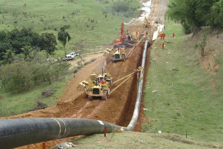


Not all wells behave the same. This statement may seem pretty obvious, but it still begs the question: what kind of range makes up ‘average’ well performance in a region? As producers are touting continued improvements in completion designs, we decided to take a look at the type curves for some of the more recent wells that have been producing in the Bakken. More specifically, we will look at how Bakken declines in the first year measure up.
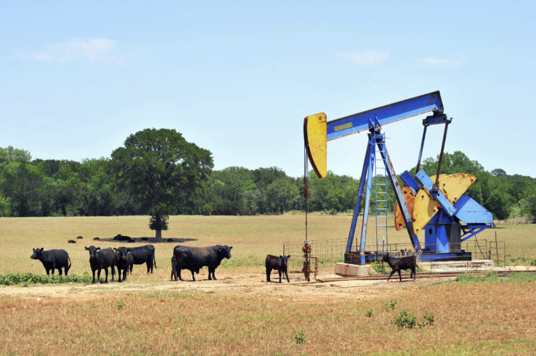
First year decline in a well is a pretty important metric. Once the well hits that max rate, the production can fall off very hard. This is meaningful to producers because the revenue the well generates is based solely off of the amount of oil and gas coming from that well. If the well has a fairly low first year decline rate, then that means it will be generating production that remains closer to that max rate, creating more revenue for that producer than a well that declines more quickly.
We’ll kick off this analysis by looking at a map that shows the first year Bakken declines for wells that were drilled no earlier than 2013 and have at least one year’s worth of reported production.
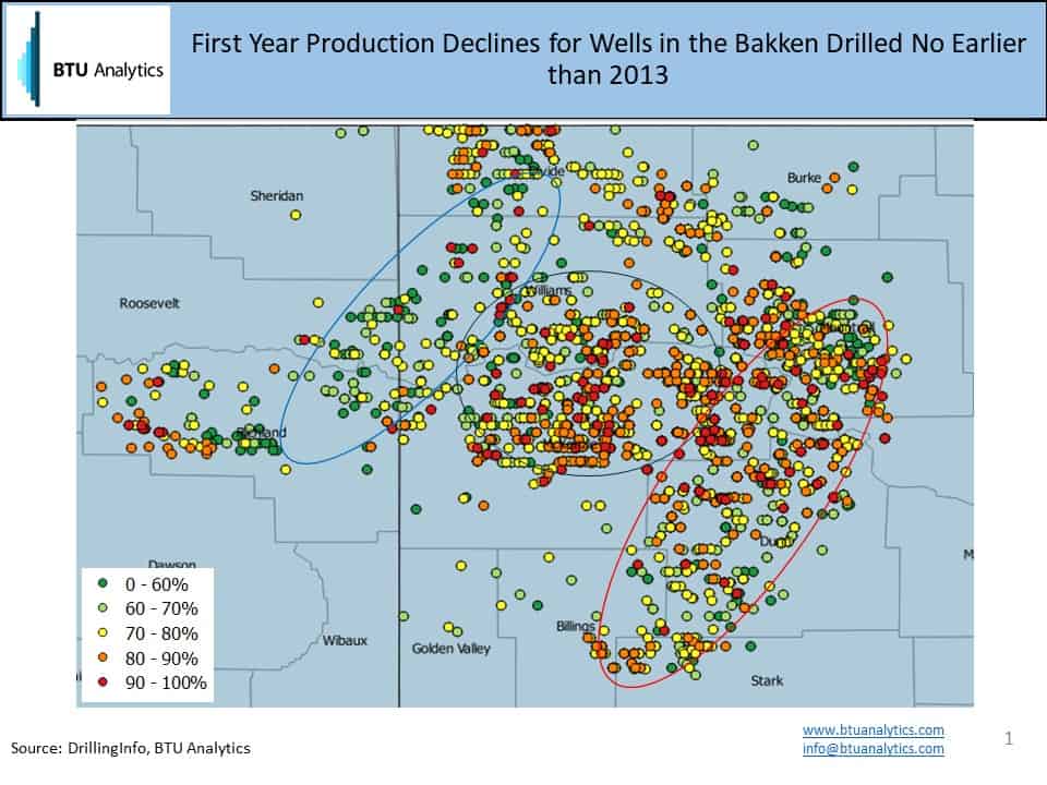
A couple of quick notes about this map. First, the percentage indicates how much production has declined in the first year since the maximum reported rate, which is generally observed in month one. Therefore, a 0% decline would indicate that the well is producing the same in month 12 as it was in month one. The average for the Bakken region is roughly a 72% first year decline, so that number falls into the yellow band. We can see three regions begin to form, where the middle has a higher concentration of the red and orange wells, showing an area where first year production has generally fallen off harder. On the western side, we see more of the green and light green wells, indicating that production does not decline as quickly in the first year in this area. Finally, the eastern area is one where the concentration of wells falls right around the average.
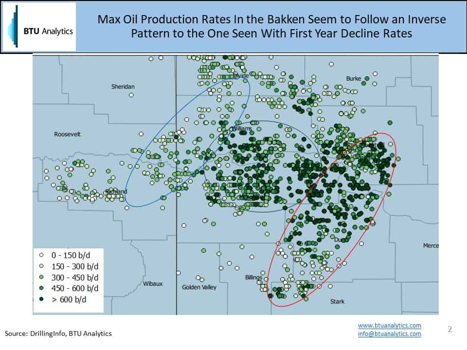
Next, we examine maximum production rates for individual wells. The region average is about 420 b/d for the max production rate. The previous map would say that the best areas are the ones with the lowest decline rates. However the above map shows that those regions tend to be associated with the smallest initial production volumes as measured by the max production rates. This would indicate that the next logical thing to examine as part of this analysis is the Estimated Ultimate Recovery (EUR) of these wells, or the estimated amount of production that will be recovered over the life time of the well. As a point of reference, if we took Well A to have a max production rate of 300 b/d with a one year decline of 70%, compared to Well B with 600 b/d with a decline of 90%, Well A ends up with an EUR of 247 Mb, and Well B has an EUR of 214 Mb assuming a 240 months (20 years) well life and an average Bakken type curve for years two and beyond. In some cases, a lower first year decline can have a stronger affect on overall production than a higher max production rate.
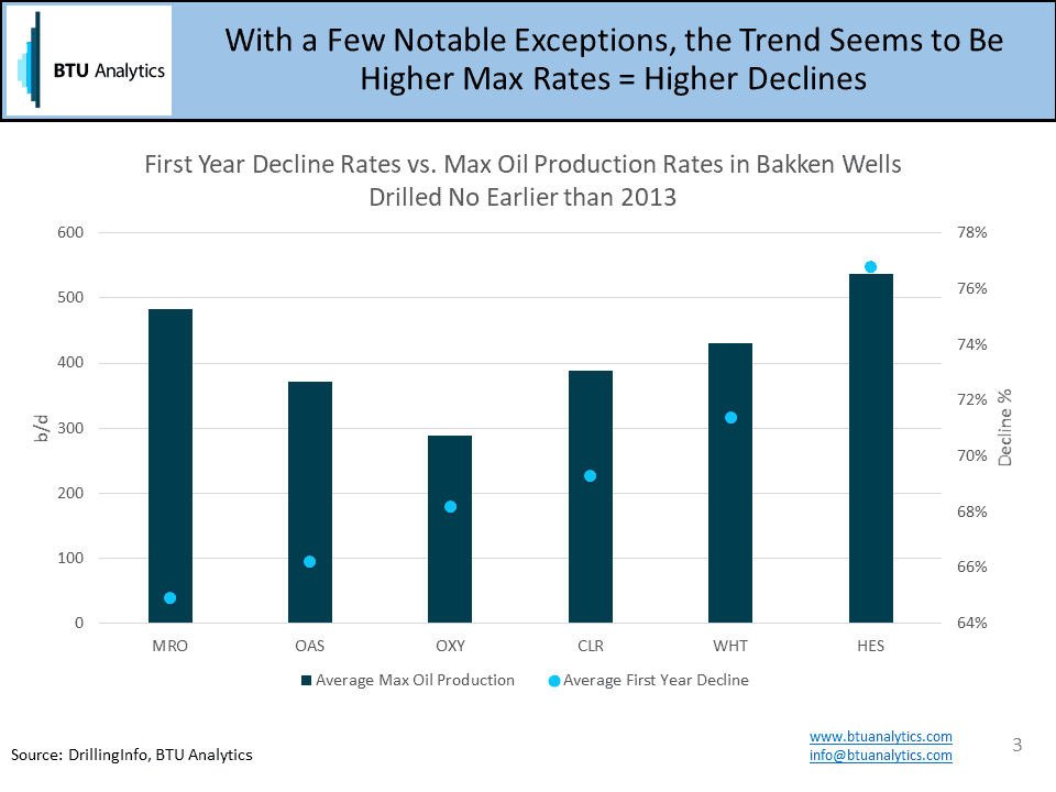
The trend from the previous maps can be seen when we aggregate average results by some of the bigger producers, with a few notable exceptions to the rule. Are new completion designs altering Bakken declines in addition to Bakken initial production rates? Yes. Is the net effect good or bad for producers? Stay tuned to BTU Analytics’ Upstream Outlook for more information.